


A quick redesign based on Material UI and BMW Group Guidelines
📍 Context
As part of the CX design department at The Retail Performance Company, I was commissioned to redesign a BMW Group internal tool. The requirements were to use Material UI and yo adapt it to BMW Group Guidelines.
At that moment, BMW Group was in the middle of their rebranding, so we were asked to work following the old guidelines and to provide clear design specs so afterwards the devs would be able to update it to the new branding and keep developing their tool, so the screens that you are about to see are merely guidelines for them to follow afterwards.
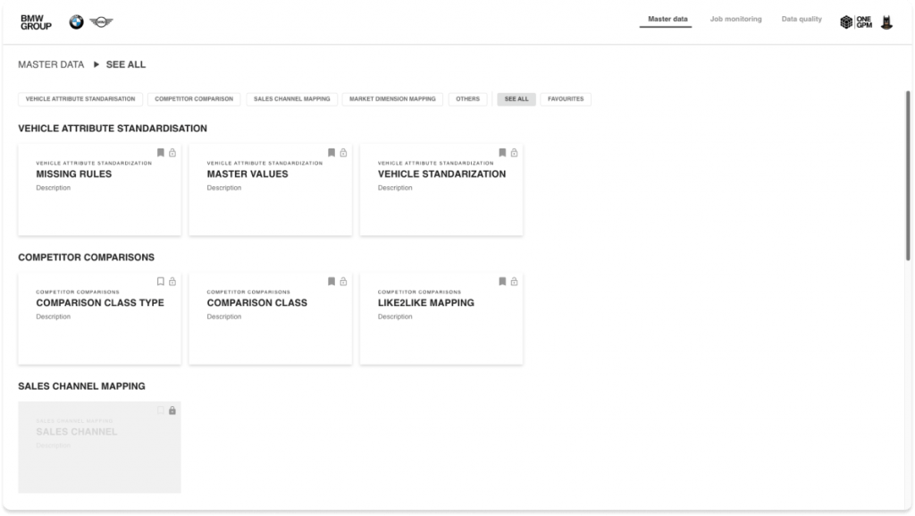
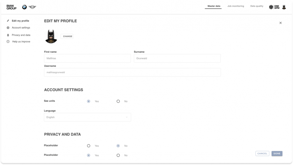
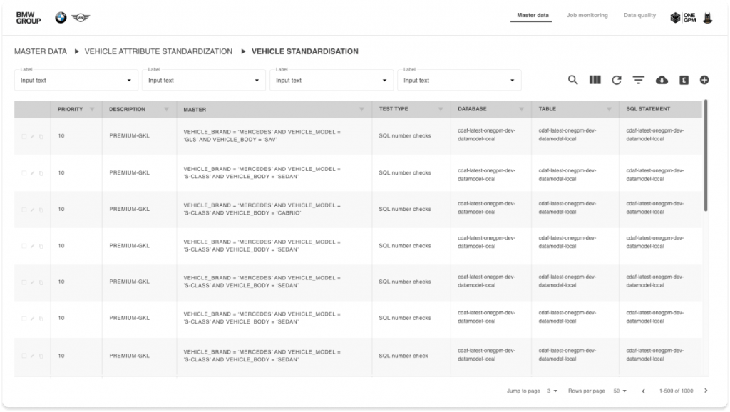
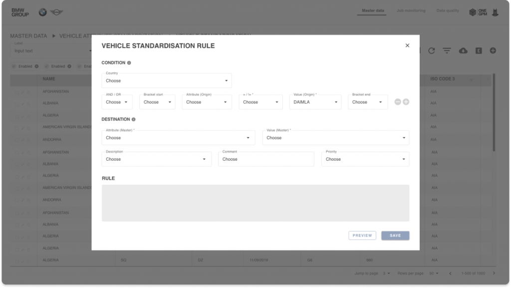
Due to NDA I can’t show the whole tool, but I’m allowed to show an overview. Here you can see some of the screens we proposed:
👷🏻♀️ UX improvements
We took the opportunity to make some UX suggestions to ensure a better usage of such complex tool, so some user stories were provided during this process that would help our users not get lost in the complexity of the tool, such as:
- Implemented bread crumbs
- Added selected state to the header
- Added sort functionality to tables
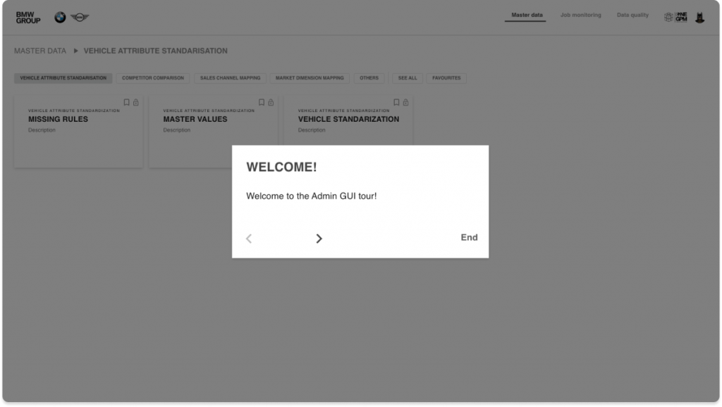
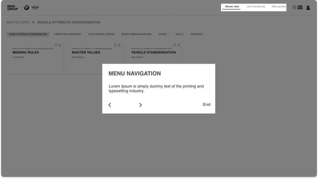
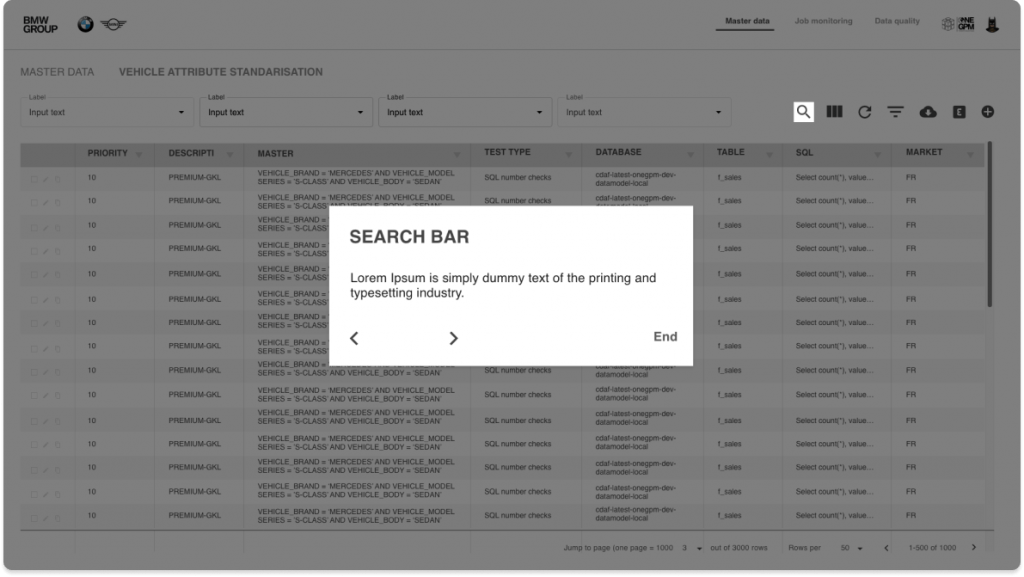
After a quick user test with 5 BMW group users with different antiquity in the company, we came up with the conclusion that the tool was too complex for new employees, so we would need to prepare an onboarding. We did something simple, just a pop up with the description and an overlay to cover the tool and highlight the specific area we want to point out.
Here are some of the screens:

This case study is incomplete, will add more info soon!