

BeInCrypto is one of the biggest crypto currency news platform worldwide with online presence in 12 languages.
Due to BeInCrypto’s quick growth, we noticed that their identity was lacking the strong and inspiring personality they had and their vision for the future. As the Design Lead of the company, I was in charge of the development of the new brand strategy and new brand identity of BeInCrypto along with the Marketing department.
Context: both the design department and the marketing department started at the same time, so we had no prior details on the company and we helped building those foundations and gathering all the information in Notion.
Workshop 1: Brand refinement
As a newcomer, my objective was to find out more about the brand, so I prepared a workshop with the board to get all that information and at the same time, to align their visions into one.
Research goals of this first round:
- Who is our main audience?
- What is our mission?
- What is BIC’s personality?
- Elevator pitch
Audience and positioning
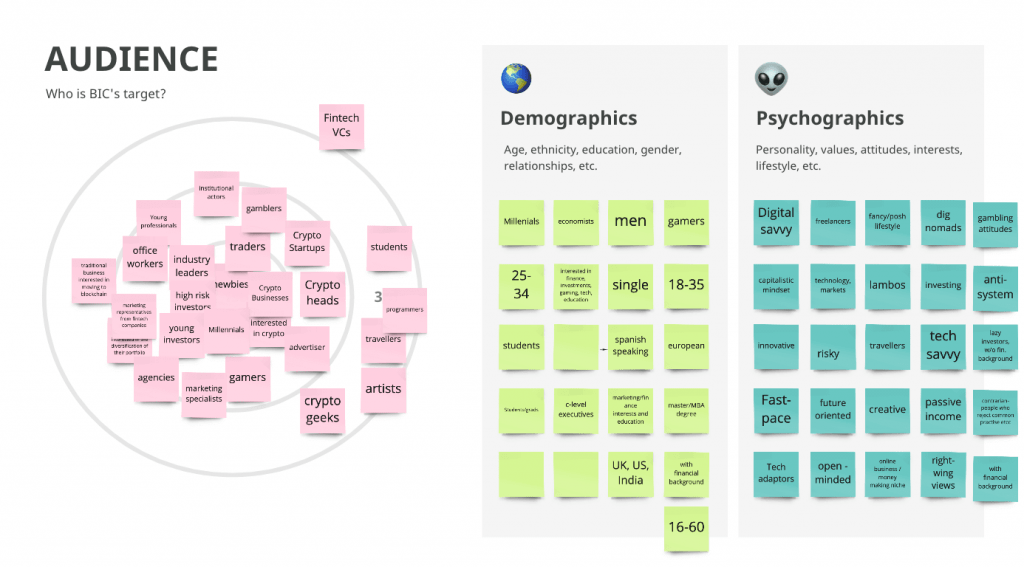
Our main target is young men who want to get started in crypto, followed by investors and professionals in the crypto industry. They are mainly located in Europe, the US, South America and India. They are tech savvy, innovative, open minded, anti system, eager to discover the world. They care about their future, about their finances, but they don’t want to get too deep into that.
Values & mission
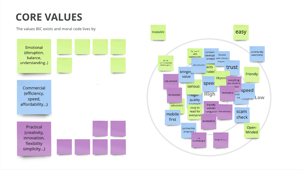
By providing content that informs, entertains, inspires, educates, and engages newbies, we aim to establish ourselves as industry leaders. Consequently, we will close the education gap by providing accessible and reliable content. The core values of our company are: we’re serious (in terms of trust), we’re objective, we’re fast, we’re high-quality and we’re friendly (in terms of accessibility and tone of voice).
Personality
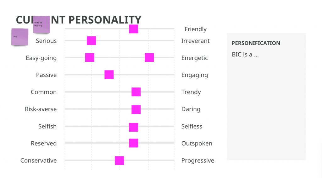
Sages, creators, and explorers. We embrace innovation in a thoughtful and fearless way. Our mission is to inspire and passionately share knowledge. It is our ambition to be more inclusive, trustworthy, approachable, engaging, new-thinking, daring, selfless, more straightforward, and more outspoken.
Elevator pitch
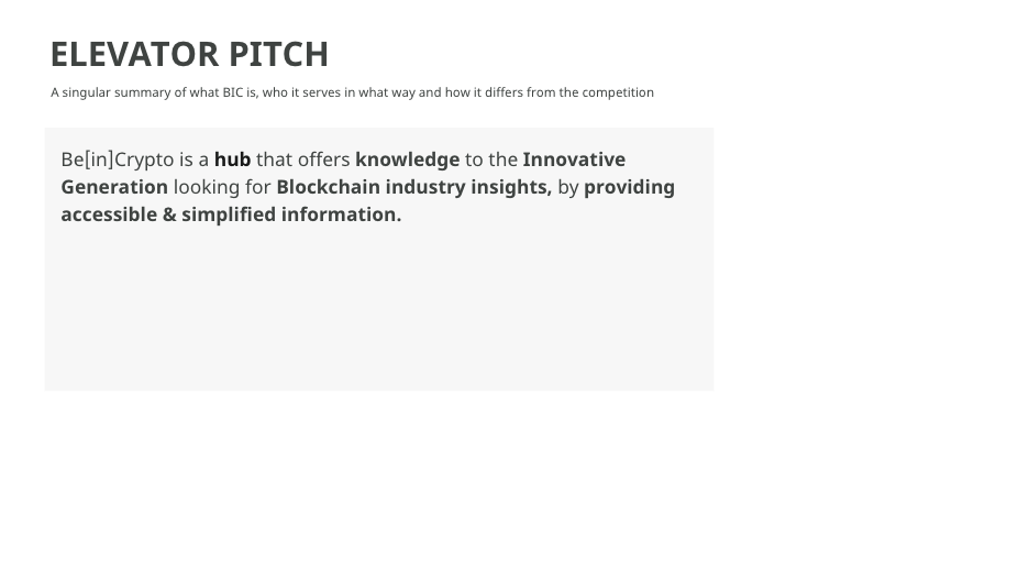
We are a hub that offers knowledge to the innovative generation looking for blockchain industry insights by providing accessible and simplified information.
Workshop 2: Persona definition
Since we learned more about the target audience and the personality of our brand, we researched about the current “crypto” personas and then prepared a workshop to present them to the board so we could define a main focus.
The workshop focused on the following questions:
- Who is our ideal customer?
- What are the riskiest assumptions we’re making about our ideal customer?
- How can we find our ideal customer in real life?
As a result, we prepared 4 fictional personas, which don’t emerge from user research but from the experience of the UX design team gathering information from several sources like stakeholders, data analysis tools and analysis reports of users from other related companies or industries.
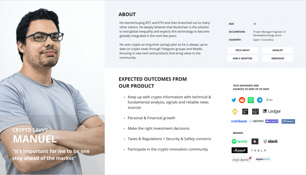
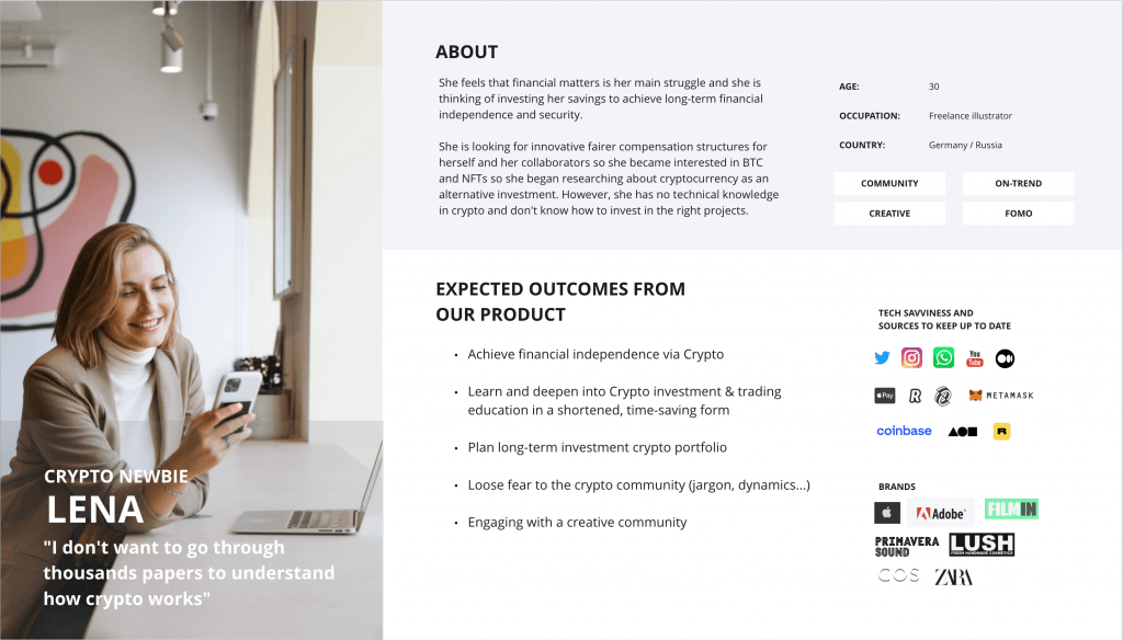
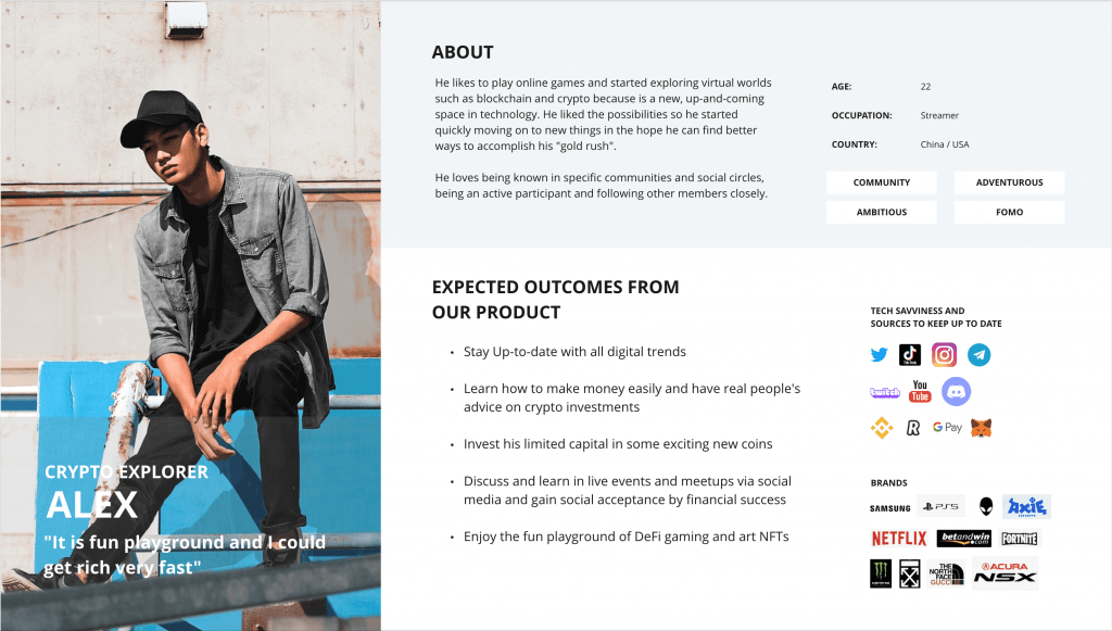
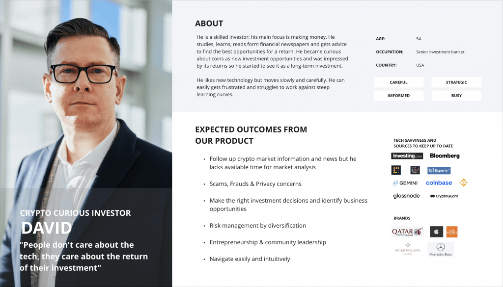
Although they are only fictional personas, this allowed us to start taking decisions regarding our rebranding strategy direction.
After many discussions with the board, it was decided to focus on Alex, the crypto explorer, to be the main target of BeInCrypto, allowing us to focus on a young and ambitious audience which will be key into the next steps of this case study.
UX process
Our website is dominated by conversion through banners, which represents the majority of our income, but now needs a UX Research project to improve the user experience on their products as Google’s SEO policies have changed and it is being penalized, reducing its traffic significantly.
While the rebranding process was being defined, we worked on an internal UX audit of our products. A user experience audit is the process used to identify potential usability issues based on established heuristics and/or prior user research. An effective UX audit targets issues to ultimately create an easier and more seamless user journey. This process can help to increase customer engagement, satisfaction, and conversions.
Methodology
Since we didn’t have much time to carry out this initial research, we decided to take a pragmatic approach using tools that enable us to understand the current status of the product and point out problematic areas in BeInCrypto interfaces in a fast and efficient way.
Tools: Advanced Heuristic Evaluation
Heuristic Evaluation
Based on this template, we divided it into 10 different parts:
- General Heuristic
- Identity and Information
- Structure and navigation
- Labelling
- Page layout
- Interaction comprehension and simplicity
- Control and feedback
- Multimedia elements
- Search
- Help
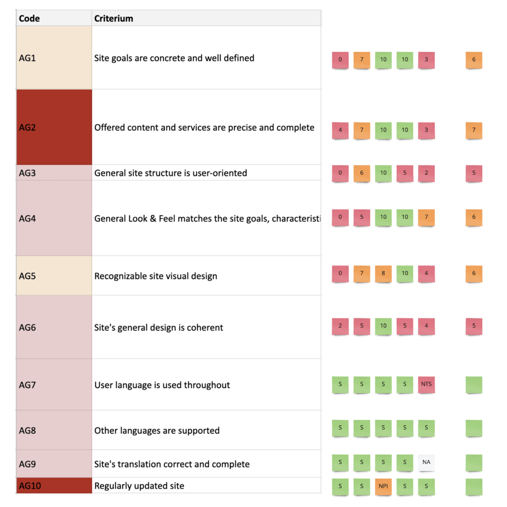
Then we gathered all the feedback:
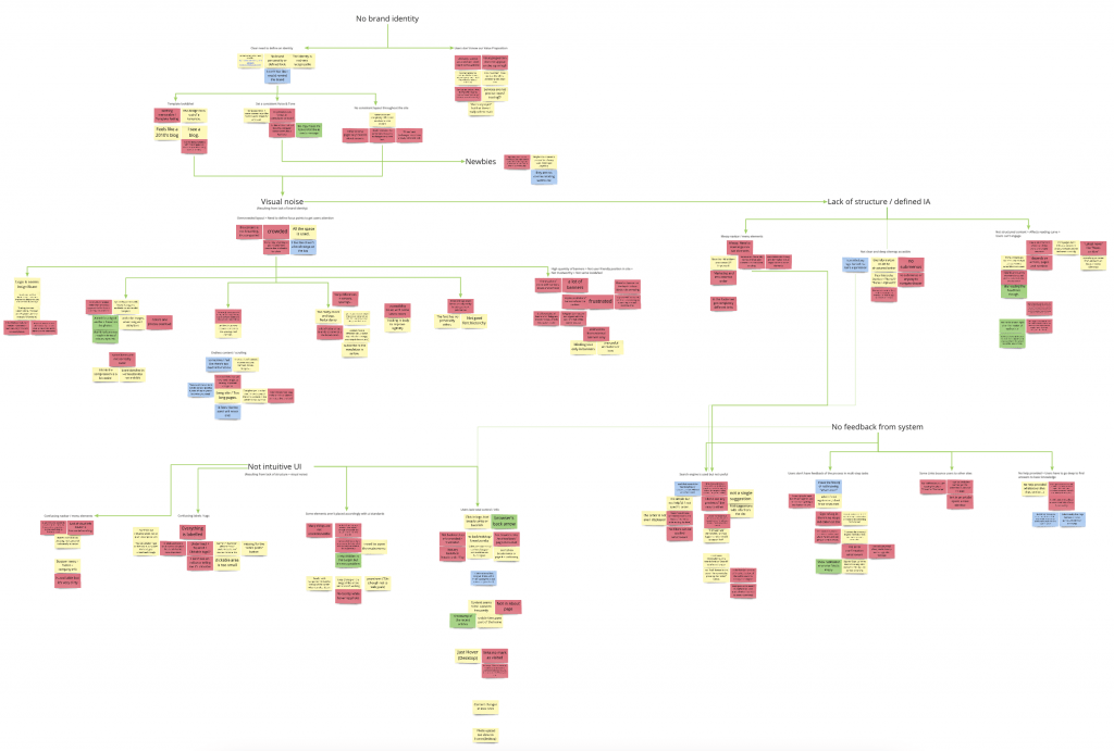
And highlighted 5 major issues:
- There is an urgent need to create a clear brand identity.
- Too much visual noise. Keep it simple.
- Define a coherent Information Architecture and structure.
- Improve User Interface elements to make it more efficient and intuitive.
- Keep the user informed: Provide feedback from the system.
This backed our rebranding proposal, so we kept working on the competitors analysis identify and evaluate the key usability strengths and weaknesses of BeInCrypto competitors.
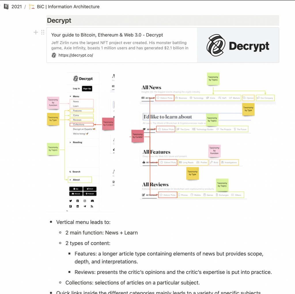
Competitors analysis
The analysis examined key user experience components by citing instances of best and worst practices from the competitors’ websites and including screenshots as examples. Our exploration of what competitors do well and what can be improved provided important learnings that were be applied to the redesign of BeInCrypto.
The direct competitors that were covered are:
- Coindesk
- Decrypt
- The Block
- Forbes – Crypto & Blockchain
Information architecture
After the competitors analysis and the heuristic evaluation were complete, we proceeded to redesign the information architecture of our main product, News (aka our home).
Information architecture is the core and the basis of a website’s user experience. It is especially important for sites like BeInCrypto that comprise so many pages and have so much content that a simple navigation system would not be sufficient.
By applying user research and usability testing, we can create an effective information architecture whose structure is based on the understanding of our users, helping us keep satisfied customers, lower bounce rates, and improve our site popularity and visibility.
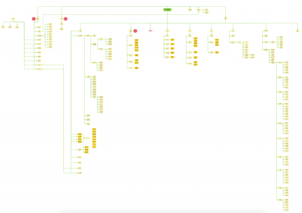
We started by analysis our current taxonomy and the one from our competitors.
Current Information Architecture
BeInCrypto current IA lacks of a clear goal: what do we want to do? make more money, reduce costs, help users make better decisions?
Presenting a wide and very deep structure, the navigation becomes difficult and confusing for our users, increasing the bounce rate and making engagement impossible. The greater the depth, the greater the cognitive load.
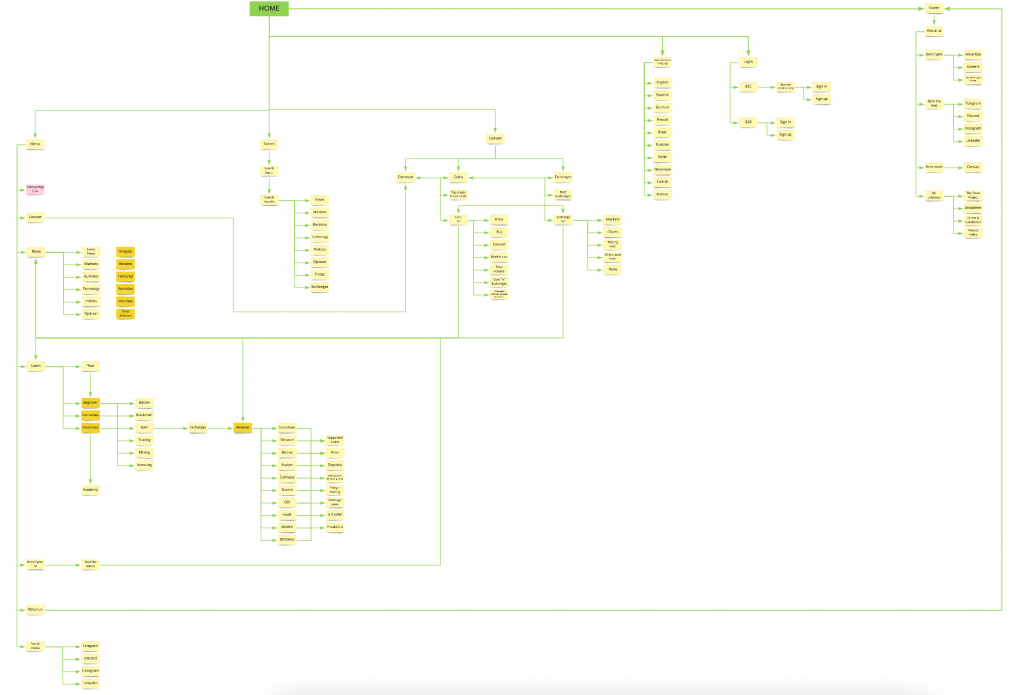
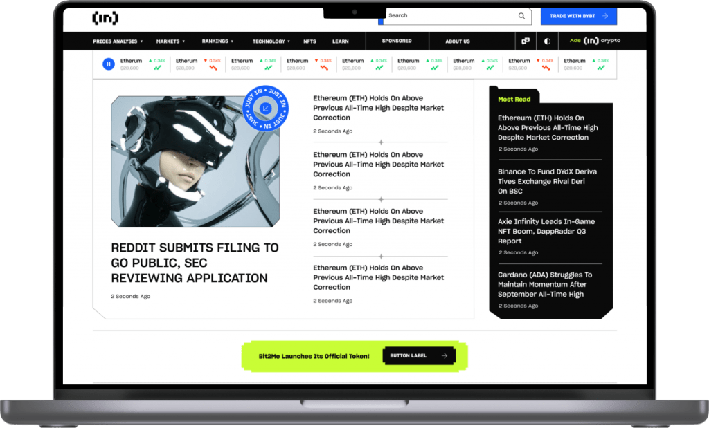
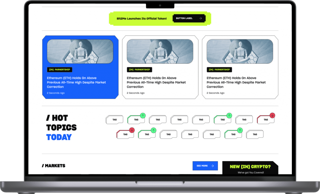
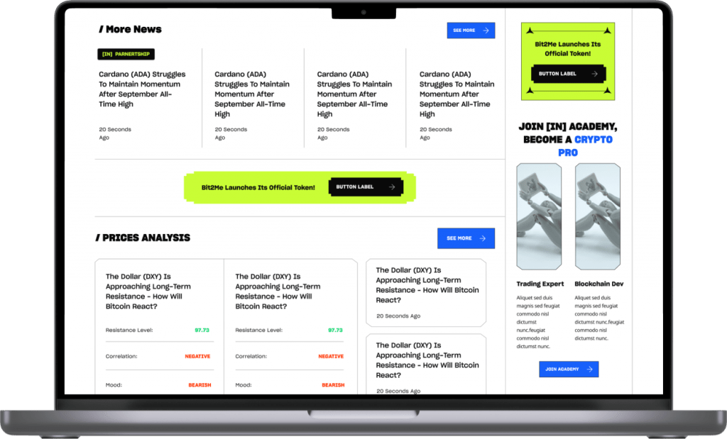
New Information Architecture
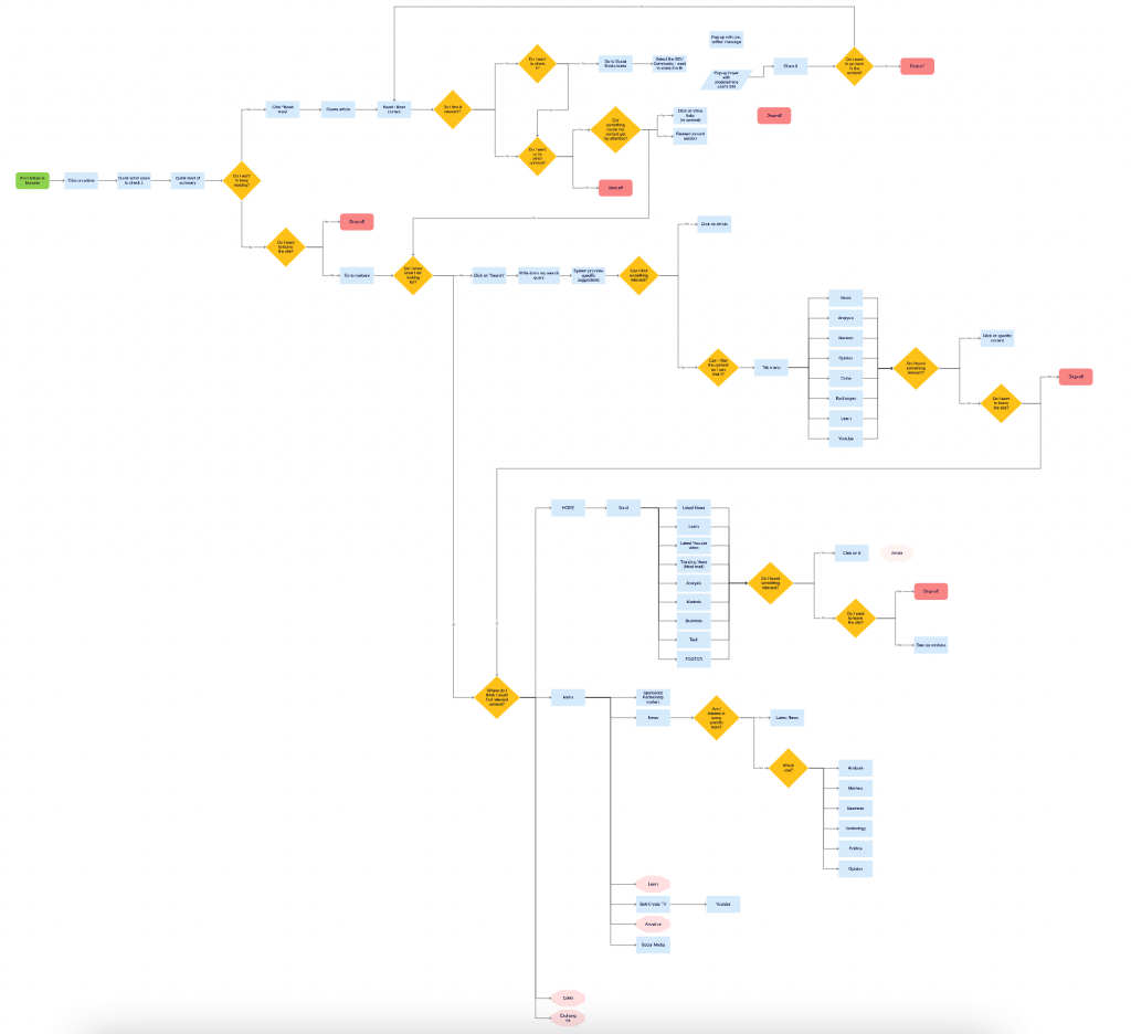
User flow
Heatmap Analysis
Meanwhile, we activated Hotjar to start recording how our users were navigating within our site:
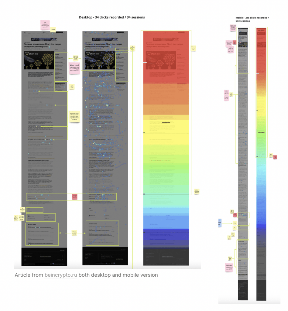
Some of the insights we got:
- High ratio of drop-offs at the very beginning
- Hot spot in top left corner
- Share icons don’t trigger any interaction
- In desktop, no interaction within the right side of the site
- There is barely no interaction beyond the end of the article
- In articles with visible clicks / taps recorded, most frequent interactions are on hyperlinks and inline link
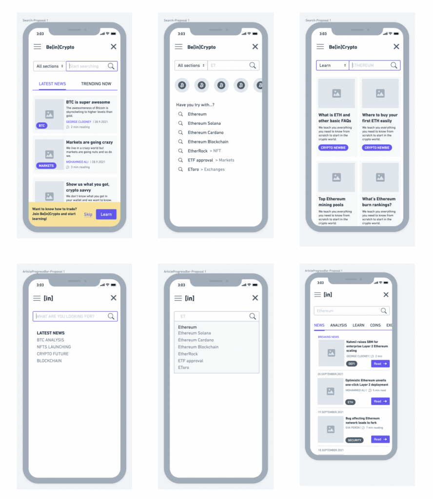
From this, we started to develop a prototype to be tested with Maze.
UX testing
Our objective was to understand the users and how they use our products in their everyday life, allows us to identify usability problems and potential for improvements, developing recommendations for optimisation. We then conducted a brief usability test.
This study aimed to find and identify usability defects during prototype usage. We considered different factors to help us define beincrypto.com desktop usability:
- Discoverability or ease of finding relevant content.
- Ease of understanding and engaging with the content.
- Time to understand navigation and interaction elements.
We conducted this test with 30 participants from Maze’s panel – 6 woman 🚺 and 24 men 🚹 from 24 to 44 years old – using a remote unmoderated methodology. 80% of the total panel were Newbies: people who don’t know anything or just the very basic about crypto and blockchain.
Key findings:
- Participants rated their likeliness to recommend the website with 7.4
- Navigation was perceived as intuitive and straightforward.
- The amount of information provided was overwhelming but comprehensive.
- Most of participants claimed the interface is forgettable and lacks brand identity.
Disclaimer: we clarified it was a plain design to test the usability only, which leads us to the next step:
Workshop 3: Design Routes
Since the main target was decided and our initial prototype was tested, our design explorations began and we prepared many different design routes that resulted in 2 favourite options:
Route 1
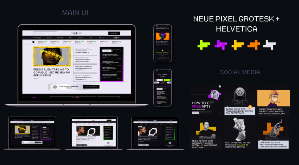
The idea of this direction is to create a strong and daring visual identity using a powerful mix of semi-pixeled modern font combinations, super-attractive bright color schemes and catchy 2d and 3d graphic elements. This direction is brave and has a strong personality which would definitely set BeInCrypto apart from its competitors. The visual language of this direction is targeted at the millennial audience and it gives us an opportunity to attract a huge number of young people to the BIC community.
Route 2
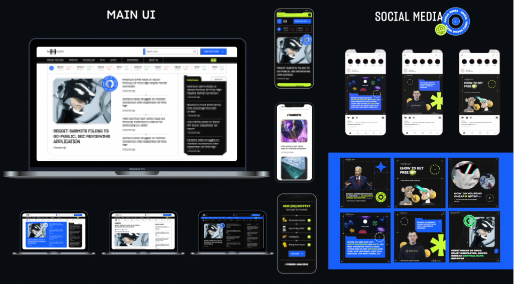
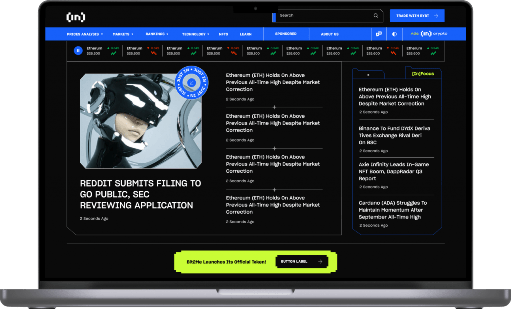
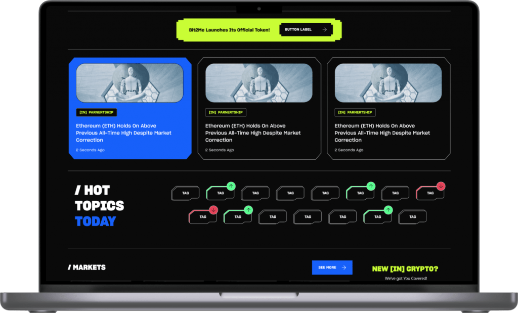
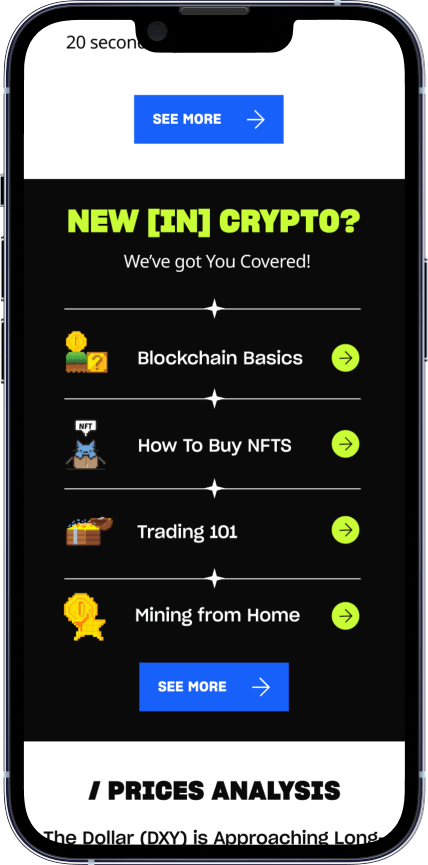
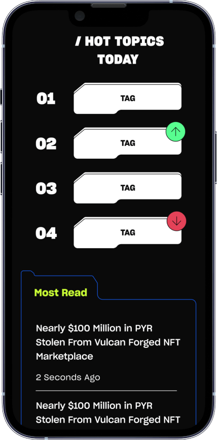
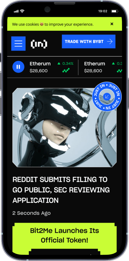
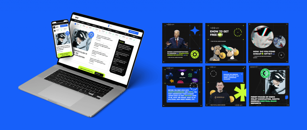
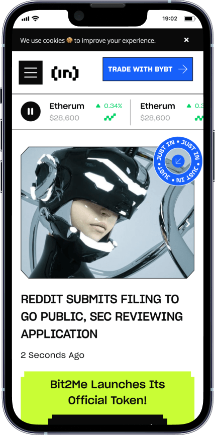
This direction is based on gamification and technology. It has sharp shapes, and the focus is on lines and typography. The shapes in the design are similar to those of modern games or technology. It is a collaboration of interesting fun direction and user friendly-oriented readable design. The purpose of the design is to create an environment for the users not to get tired of reading the news. The sharp colors are used to give more importance to the necessary information.
We then prepared a poll in Maze that we shared with a group of 30 real users that aligned with our desired target.
In the end, route 2 was selected to be the new brand image of BeInCrypto 🥳.
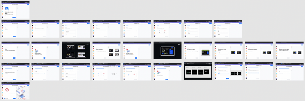
Design System
Since route 2 was selected, we aligned with the devs team to design our new (and first) Design System. Since we are still refining it, this case study will be completed soon. Meanwhile, let’s move to a more visual part, mockups!
We also worked on a night mode version: