📍 Context
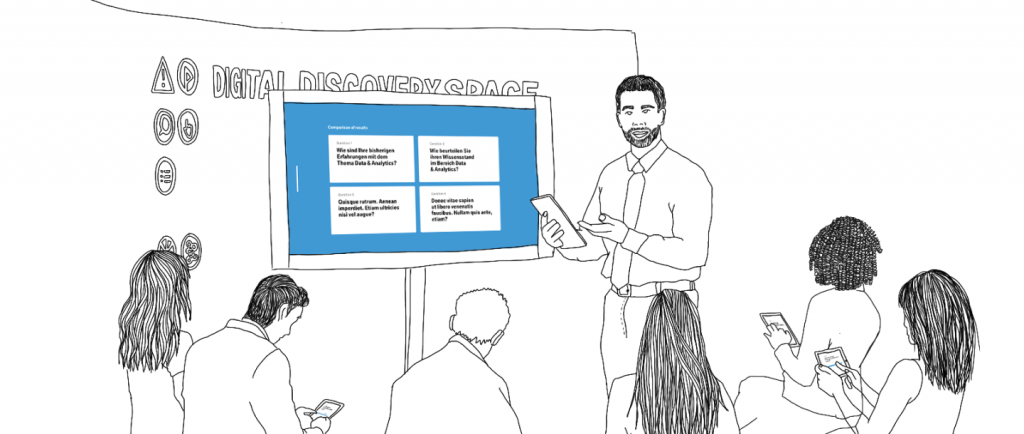
For the BMW Data Discovery Space (from now on DDS), as UX/UI designer at The Retail Performance Company, I was involved in the proposal of a digital workshop tool to collect inputs from participants that can be evaluated and shared with participants and stakeholders. Thereby allowing the DDS team to compare the answers with previous participants.
Currently, the participants and DDS team might only be able to see the results of their evaluation in comparison to their current group, but not compared to their wider organization.
The DDS team and participants would have the opportunity to compare and contrast the results, creating a more meaningful connection across the different departments.
✍️ Prototype
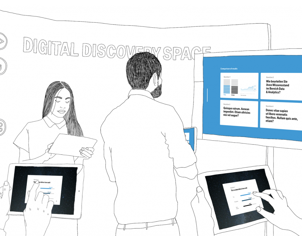
The required format for this prototype is iPad. We proposed one tool with two different views: moderator and user.
The moderator view includes a side fold out that gets him/her the dashboard of questions and answers, meanwhile, the user view is limited to what the moderator allows him/her to see.
Step 1: Welcome to the Data Discovery Space!
This screen is the same for both views, but the moderator can already notice the side fold out option.
Step 2: First question
In this screen, the moderator gets an overview of the questions he/she will go through. Following the moderators’ guidance, the users will only be able to see the first question, where they would see a slider. As some users are not that familiarized with sliders, we included a UX hint of a hand simulating the slider functionality.
Step 3: Results
Once the first question is answered by all the users, the moderator gets a data visualization of the answers of the group, plus a the overall results of all the participants that have given feedback at the DDS.
The users only see the overall answers in the group.
Step 4: Repeat with more questions!


