

📍 Context
As part of the CX department of rpc – The Retail Performance Company – I was required to design an identity for a new brand, Quanos.
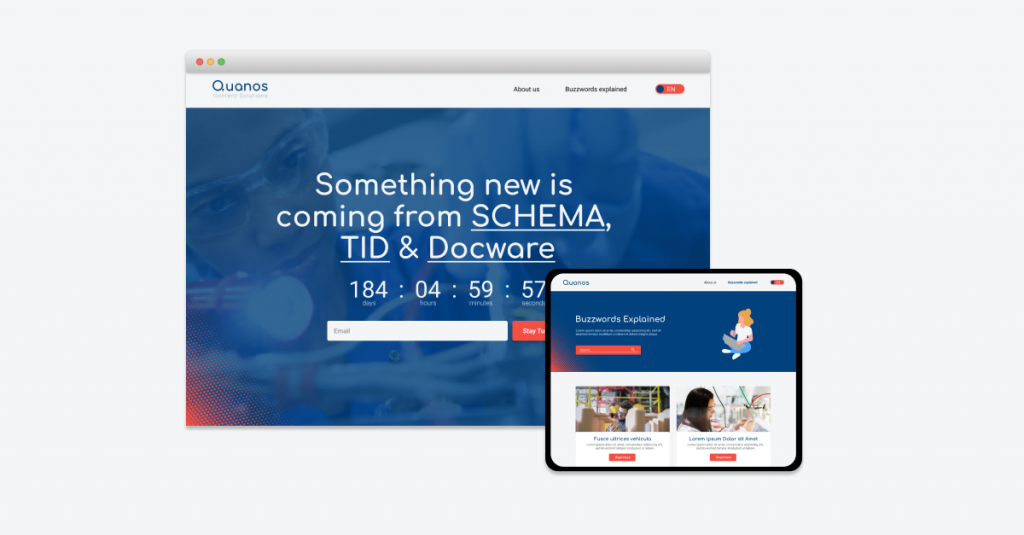
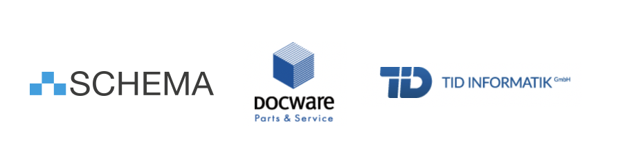
Quanos is the result of the acquisition of TID and Docware by the Schema Group. The official website will launch in November 2020. Feel free to visit its landing page which is live now.
I am going to share only a small part of our process and decision making for Quanos design guidelines.
🛣 Design routes
Half of the tech companies are blue, a color that represents intelligence, trustworthiness, and maturity. Basically, in blue we trust.
As the 3 companies that originated Quanos were also blue, we didn’t want to propose an alternative that was lacking it, so we proposed 3 design routes:
The safest option
A combination of different blue shades coming from the original companies. A soft and sophisticated look.
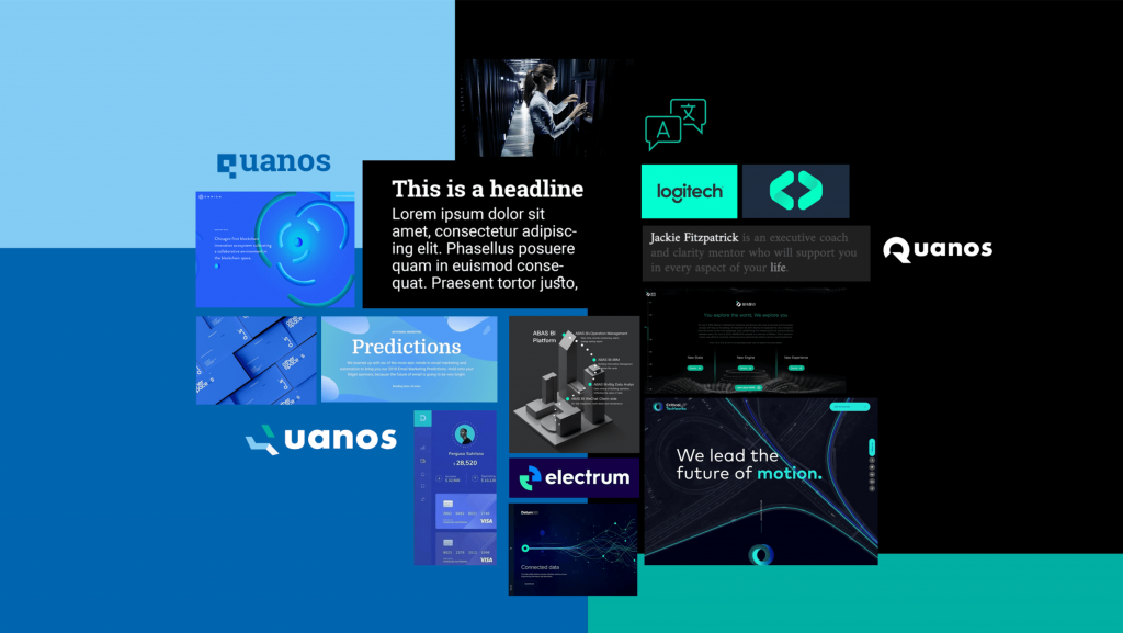
The dark mode
A combination of 2 blue shades coming from the original companies, combined with a version of the colour that one of them used as highlight, green. Green adds balance and harmony to this dark mode version.
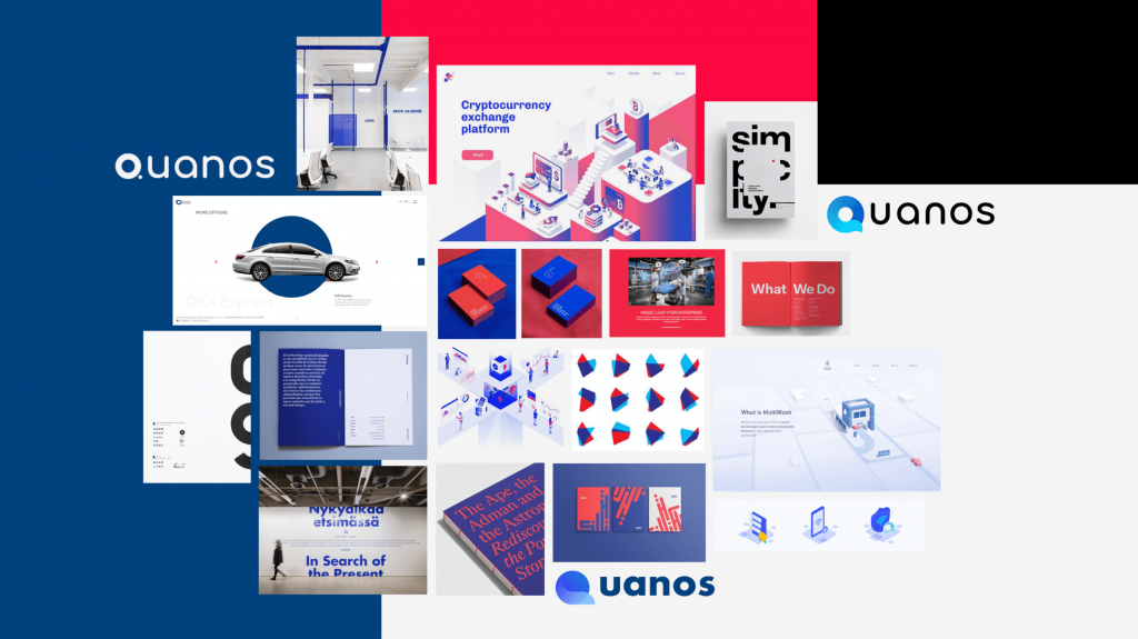
The coloured minimalist
In contrasts we trust. We selected a dark blue in combination with a bright red, which calls for attention adding energy and power in a tech world. And black and white to keep it minimal.
🔍 The logo
Quanos logo represents the character of the entire company and is a central part of their brand identity.
The icon is derived from the simplified of a magnifying glass and represents the fast finding high-quality information and the fast scaling of applications for their customers.

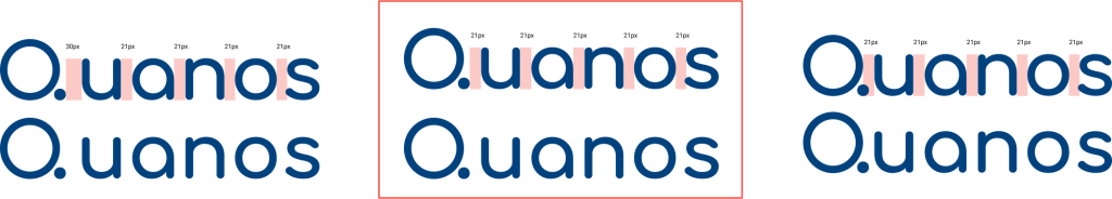
To ensure readability, we tested different space in between letters, choosing the one on the middle.
In order to have a responsive logo, it can be simplified by only displaying the Q of Quanos:

🎨 Colour palette
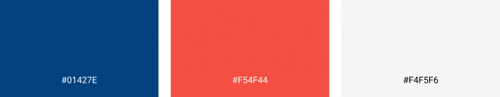
Taken from the third route, Quanos color is dark blue, highlighted with a bright red. To keep the appearance neutral and clean, light grey and black are used.
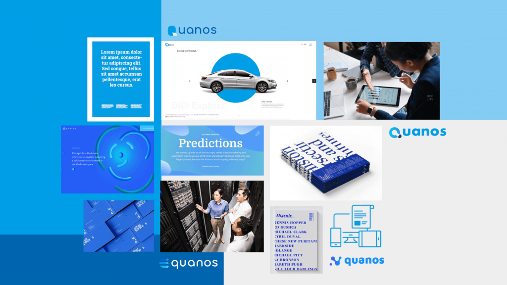
We also defined a secondary colour palette to be used for graphics:

✏️ Typography
Quanos font is Comfortaa, a rounded, friendly font that is used for Quanos logo itself, as well as headings and quotes.
For paragraphs, we chose Schema’s font, the sans serif Roboto, in its regular and bold weights.