📍 Context
As UX/UI Designer at rpc, The Retail Performance Company, I was required to design a proposal of ROI Calculator for Schema. After being provided with the wireframes, I took care of the UI of the tool as well as a few UX adjustments from my side.
👷🏻♀️ User flow
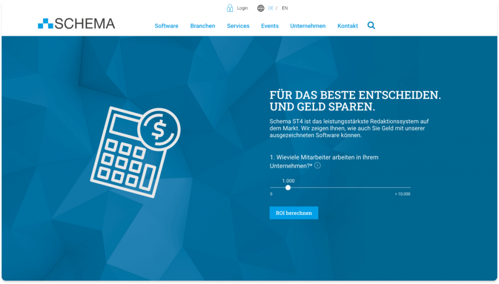
Once the user opens the Schema website, a hero slider featuring the first question of our ROI calculator will appear. The idea behind it is that the users engage with the tool before getting into it. The users are able to move the slider up or down and once they click “Calculate ROI” they are redirected to the tool.
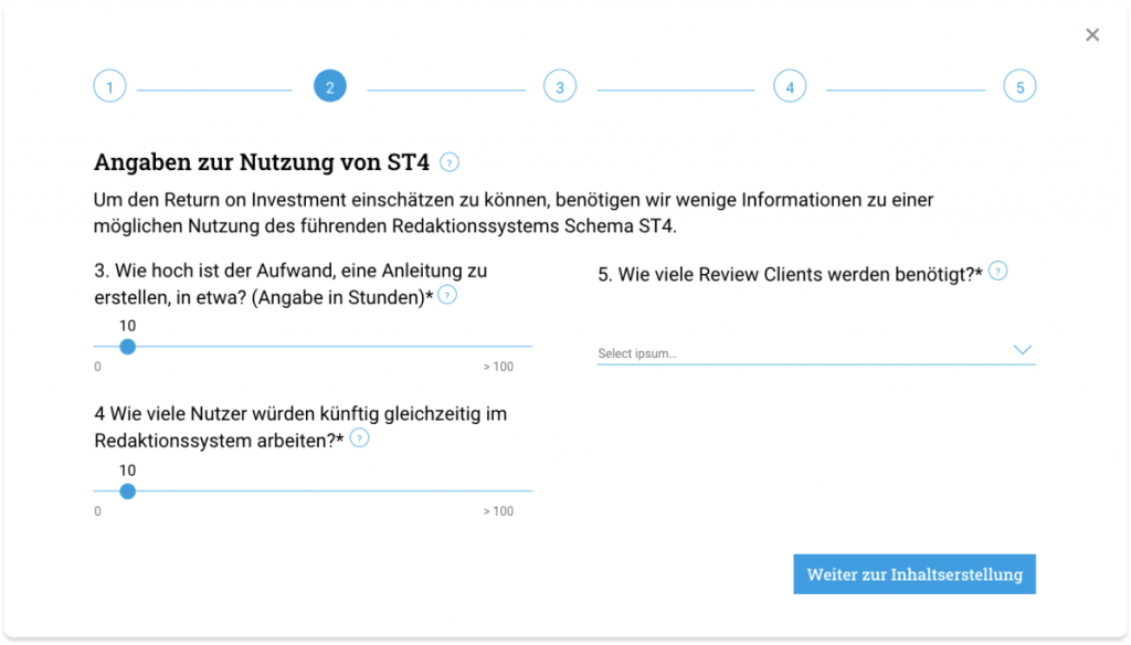
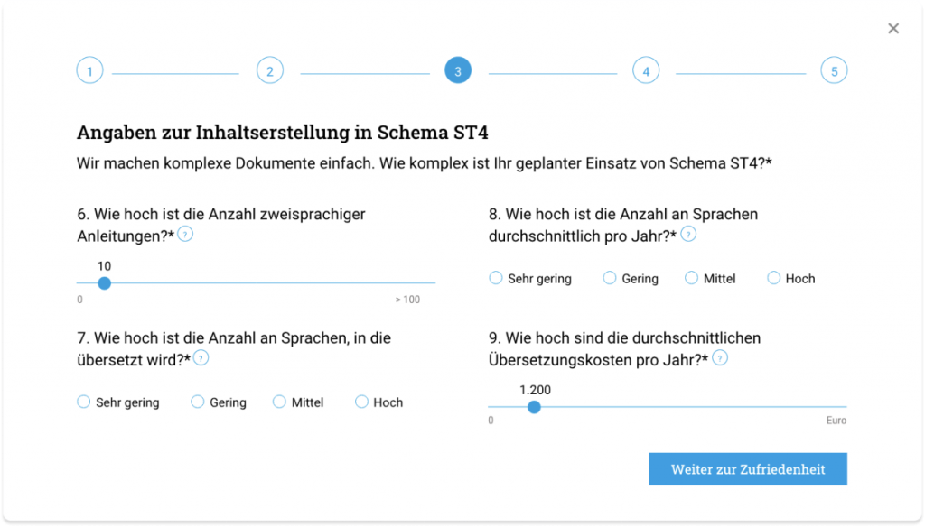
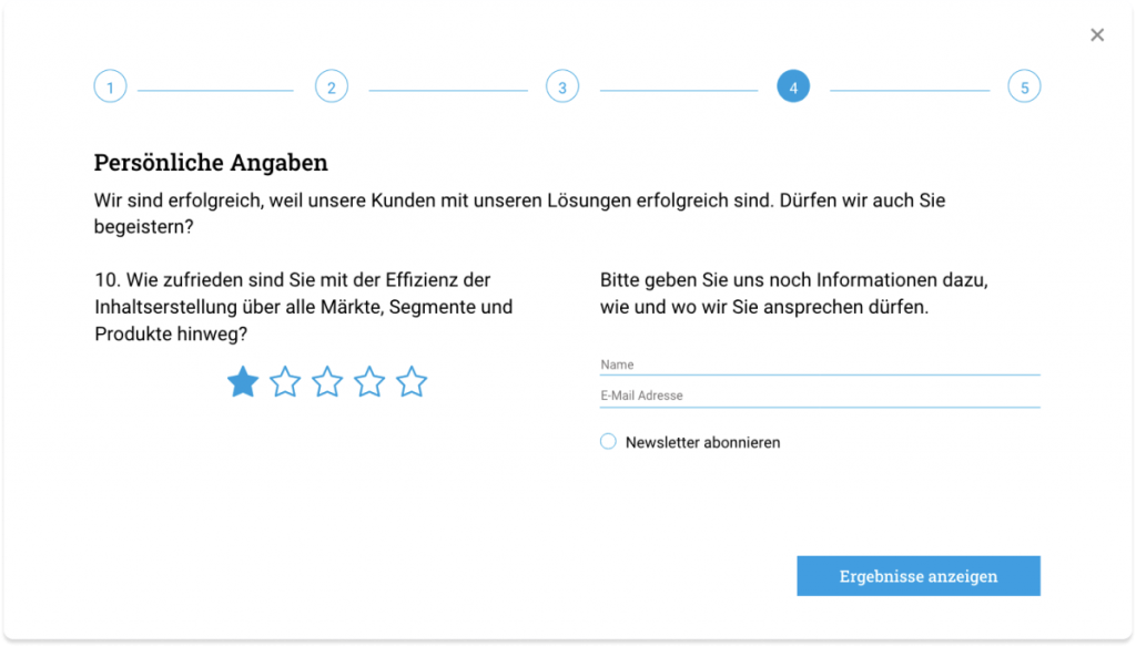
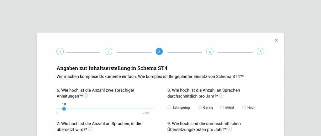
As questionnaires seem to be a boring task to complete, even if it is for your own interest, we structured the tool in 5 steps, which would always be visible and clickable in order to go back and forward.
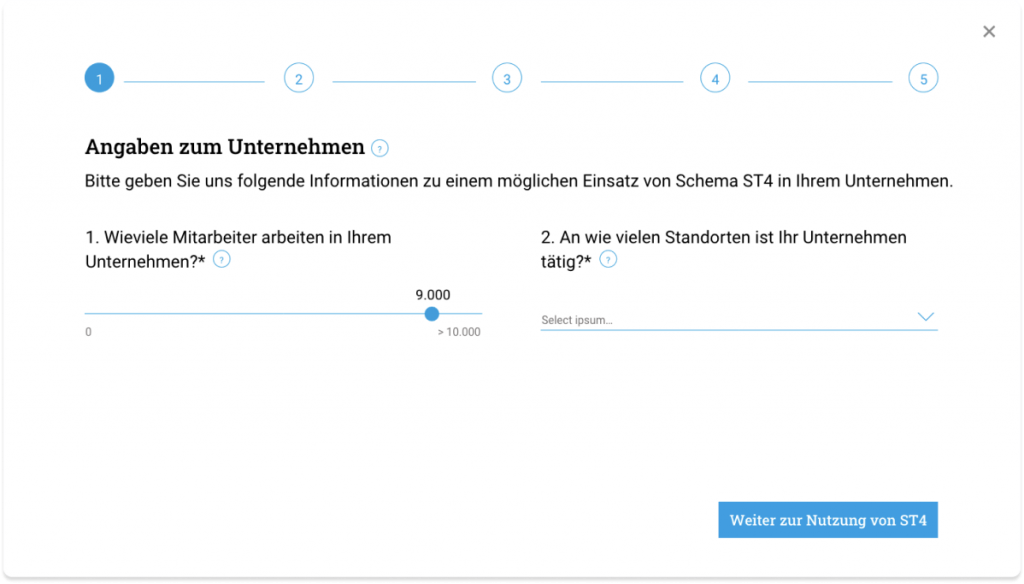
In the first step of the ROI calculator, as the user has already pre-filled the answer in the hero slider of the home page, the result appears, so one question has already been solved, therefore it feels like a “motivation” to keep going forward.
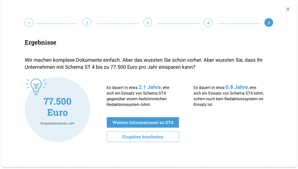
Once the users get to the 5th and last step, they get to see the result, the amount of money they could be saving by using Schema’s services plus a summary developing this results.
We added a CTA button that highlights from the rest of the layout where the users can get more information about the project, and a secondary button that allows the users edit their entries. We added this option just in case the navigation between sections wasn’t intuitive enough.
