Direct Booking Manager
Refreshing a widely used but dated booking engine so it feels native to each hotel's brand, works on mobile and feeds clean guest data into the rest of the ecosystem.
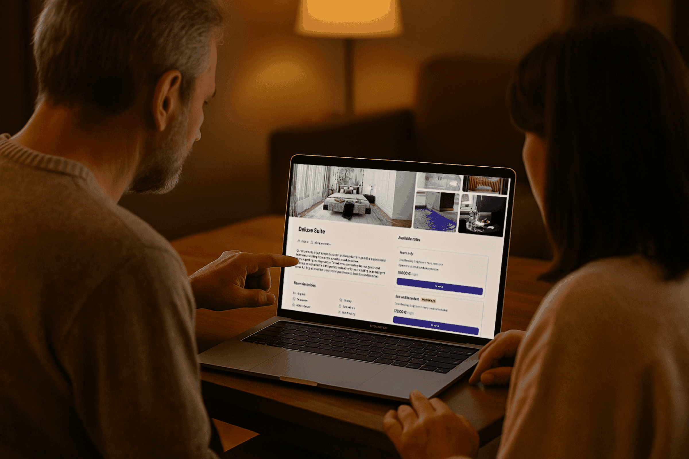
At a glance
The problem
A widely used booking engine that looked dated, lost guests on mobile and didn't match the rest of the guest ecosystem.
My role
Sole product designer: funnel and abandonment analysis, baseline and iteration testing, and modernising the UI on the shared design system. Worked with a PM, a dev lead and 6 engineers.
Impact
Booking tasks 25% faster, about 20% fewer drop-offs and a 10 to 20% conversion lift.
Skills
Tools
Maze, Hotjar
Outcomes
25%
faster booking task completion
~20%
fewer drop-offs, mostly on mobile
10 to 20%
booking conversion lift
15%
higher user confidence
Context
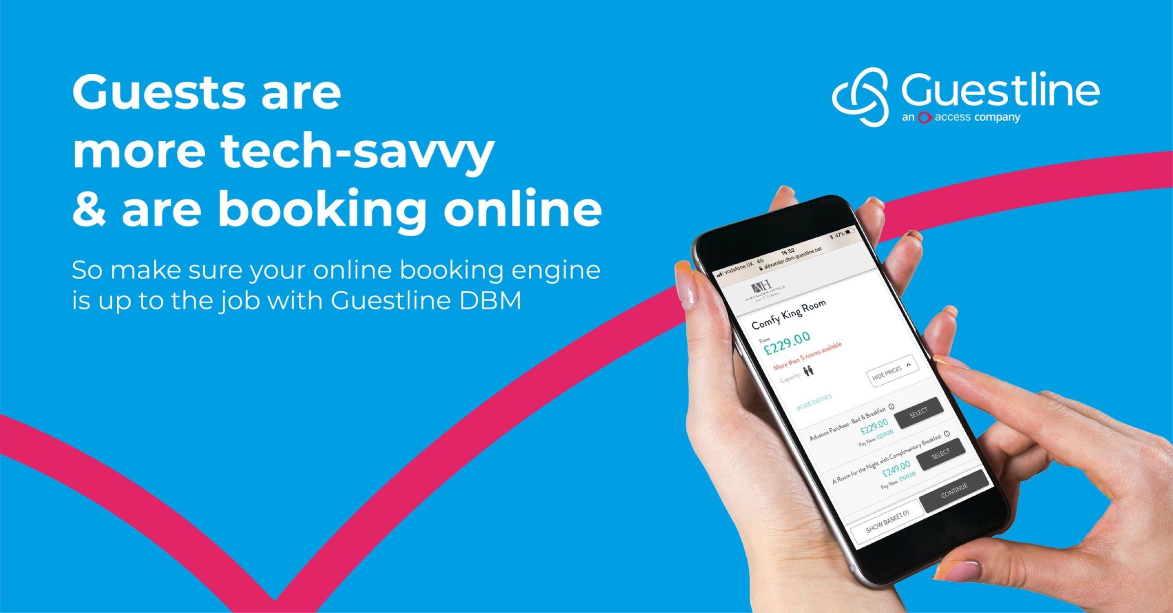
The Direct Booking Manager is the booking engine hotels embed on their own websites. It worked and was widely used, but it looked dated and felt disconnected from the newer Guest Portal and Kiosk.
It also matters more than it looks. Unlike OTAs, direct bookings capture the guest's real email, which is what makes pre-check-in, upsells and invoices possible later. So the brief was to elevate it, not rebuild it.
What I found
From hotelier interviews and a comparison with OTAs:
- Guests expect a mobile-first experience, because that's what OTAs give them.
- Hoteliers want the booking engine to feel like part of their own website.
- Prices and policies needed to be much clearer to build trust.
What I did
I modernised the interface on top of the shared Guest Design System, with the same principles as the Kiosk and Portal: clarity, autonomy, accessibility, brand adaptability and responsiveness. Hotels can set their colours, fonts and corner radius without breaking usability.
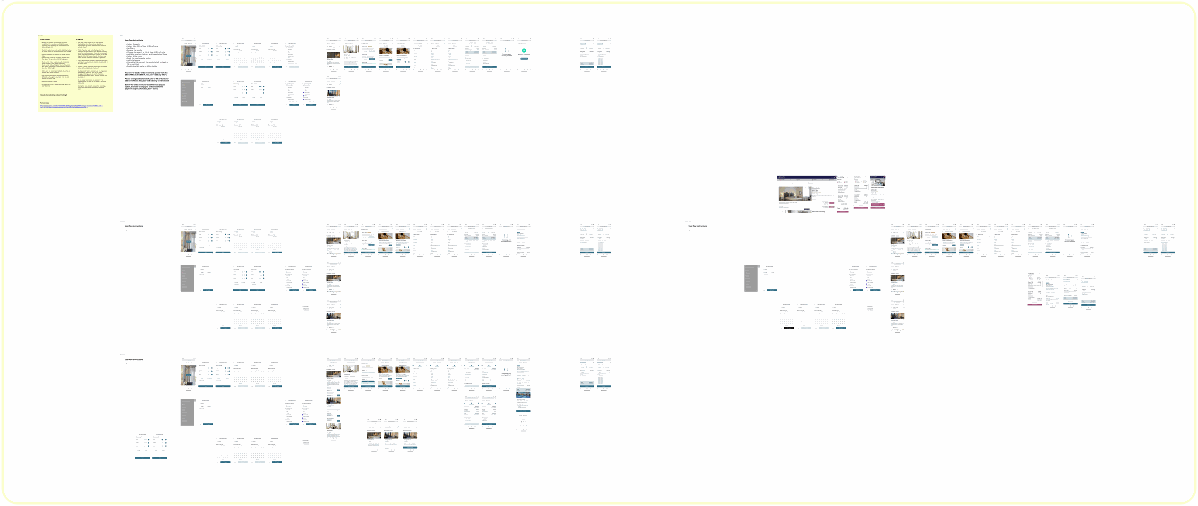
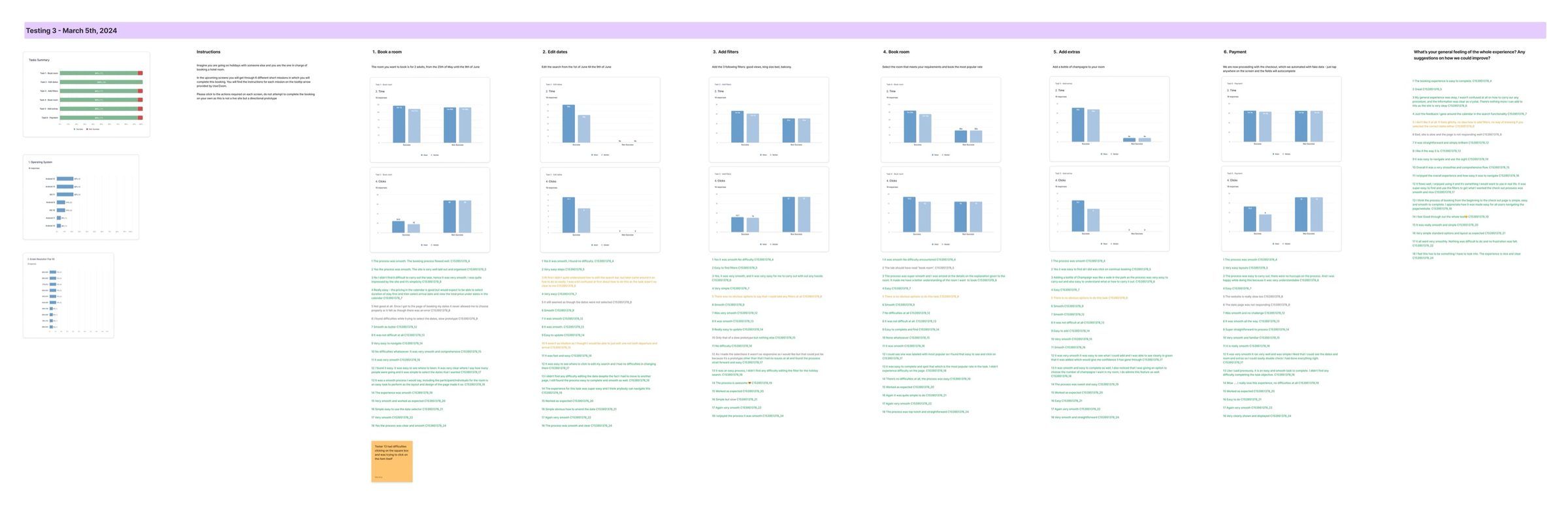
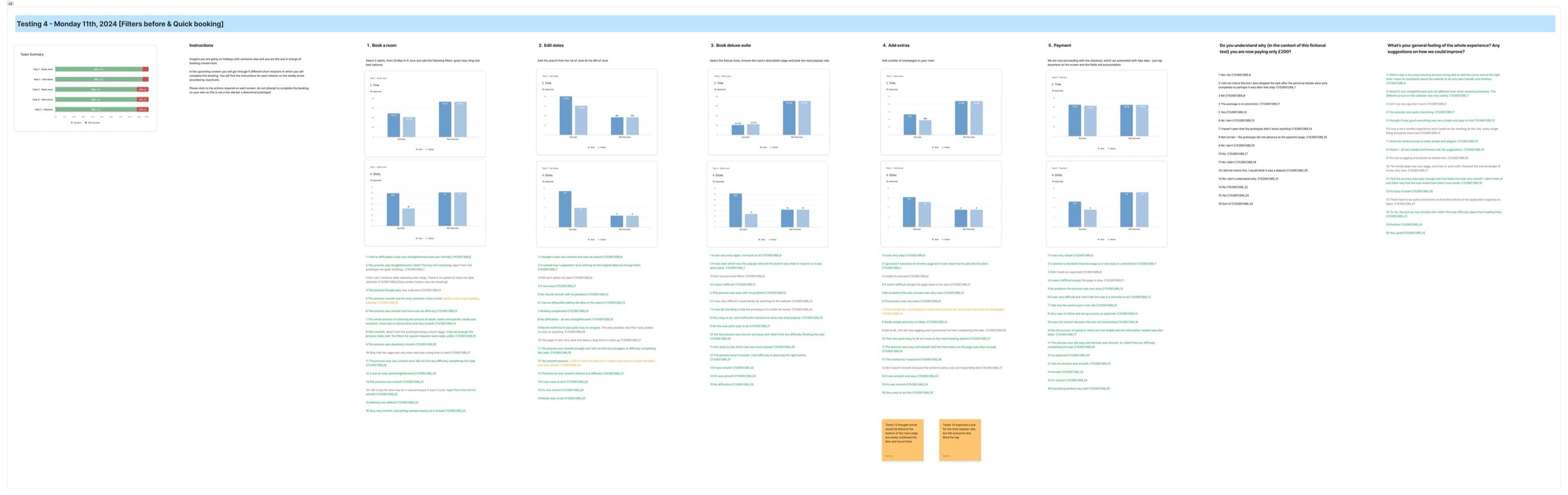
I tested before and after. First a baseline: funnel, device and abandonment analysis, Maze tests and Hotjar, which showed mobile friction and hesitation around pricing. Then Maze tests of the redesigned flows to validate each iteration.
Results
- Participants completed booking tasks 25% faster
- 15% higher reported confidence
- About 20% fewer drop-offs in Hotjar, especially on mobile
- Booking conversion up 10 to 20%, against an industry benchmark of 5 to 15%
The rollout was still in progress when Guestline was acquired, so the live product is a mix of old and new for now.
Next project
GuestStay Portal →